Is your viz ready to share?
Upload a dashboard, slide, or report. Get scored feedback and specific fixes — before your audience sees it.
Free · No sign-up · Under 60 seconds
← Drag to compare →
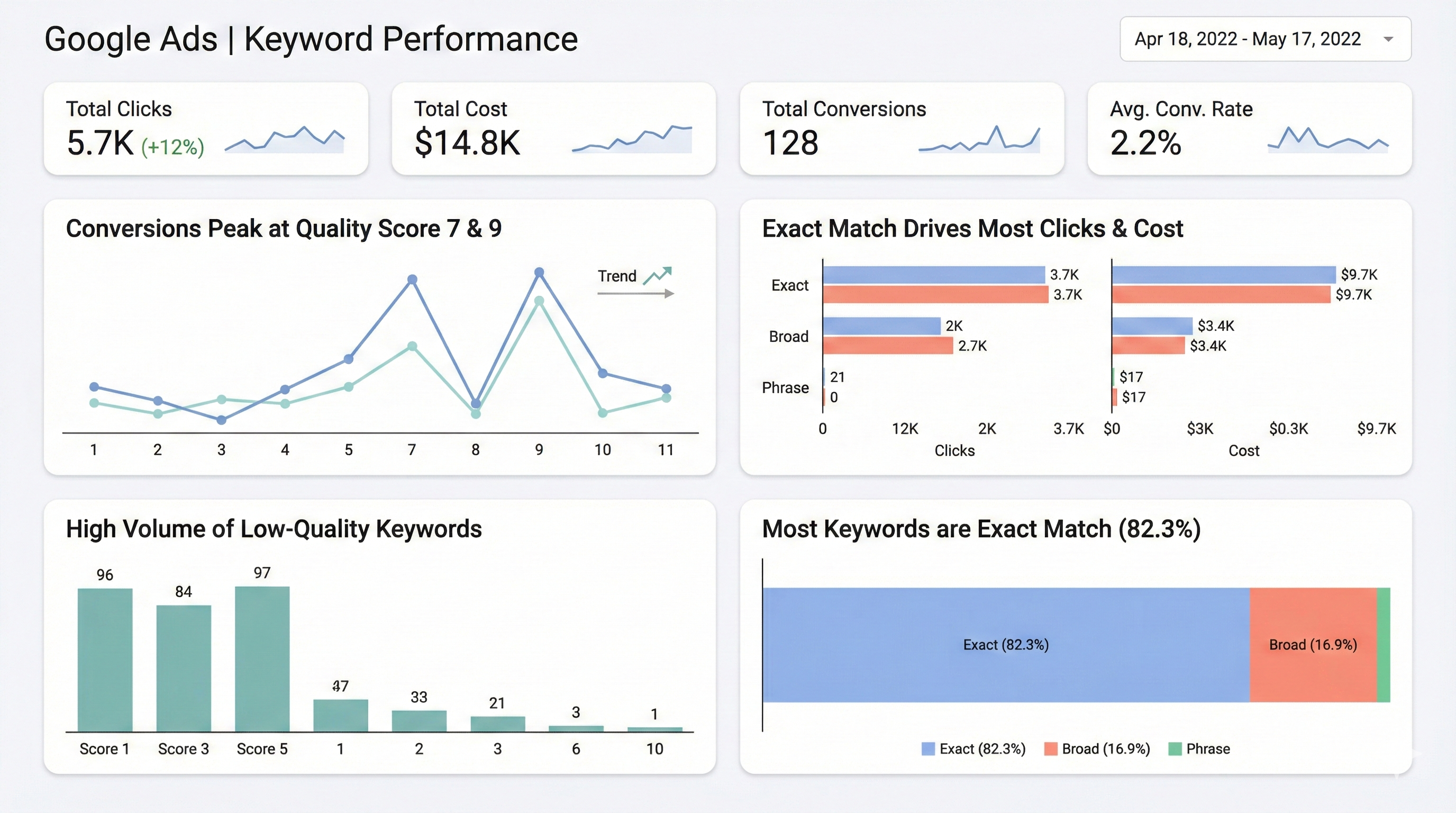
We ran pre-flight on a Google Ads dashboard.
Here's what SheetShow found — click the markers to explore each issue.
This dashboard is a cognitive minefield that hides critical performance failures behind inconsistent colors and siloed charts.
Blue means three different metrics across three charts — the color channel is actively lying.
Weight: 25%No targets, benchmarks, or CPA goals visible — raw numbers without context.
Weight: 20%The 75% conversion drop has the same visual weight as impressions — no hierarchy.
Weight: 20%Donut charts and dual-axis lines waste pixels, but the heatmap is useful.
Weight: 15%Three-column grid is logical but siloed — related metrics are split across columns.
Weight: 15%Color-only encoding with no shape/pattern differentiation; small text in cards.
Weight: 5%Think your viz is better? Prove it.
Works where you already work
One click. No uploads. No tab switching. SheetShow runs directly inside your browser — on any tool, any dashboard, any slide.
Three steps. Zero design degree.
Upload
Drop any viz — dashboard, slide, report, or email. SheetShow auto-detects the type and applies the right framework.
Diagnose
Evaluates structure, not just style — argument, hierarchy, decision-enablement, and narrative flow. Scored 1–5.
Fix
Get your top 3 priority fixes with specific instructions you can apply in 5 minutes. No vague advice.
Not just another AI review
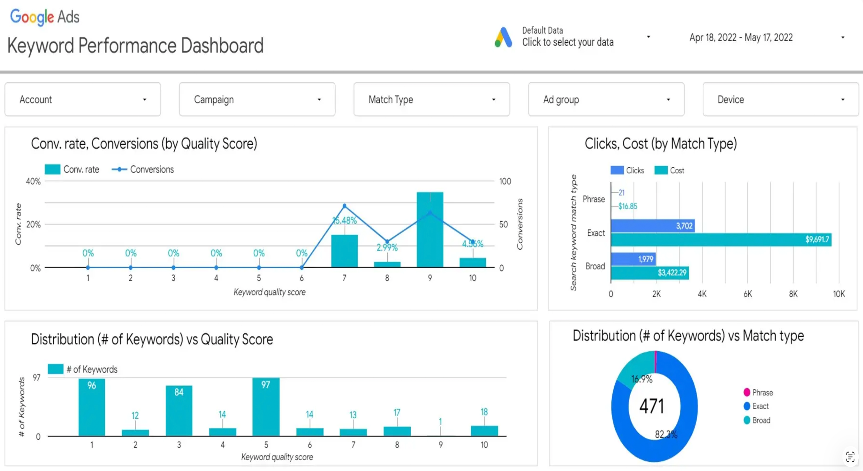
Same dashboard. Two very different reviews.
Consider using a bar chart instead of a pie chart for better comparison.
The color palette could be more accessible. Try using colorblind-friendly colors.
Add a title to provide context for the viewer.
The layout looks a bit cluttered. Try simplifying.
Generic advice. No scores. No specifics. No framework.
Donut charts and dual-axis lines waste pixel space. The top chart encodes three metrics but only one drives the decision.
Three-column grid is logical but visual weight is bottom-heavy. Move KPIs above the fold.
Replace the dual-axis line chart with a single KPI sparkline. This recovers 40% of above-fold space for the metrics that matter.
Your slide title is describing data.
It should be making a point.
SheetShow's Headline Analyzer reads your slide title and tells you which one you wrote — then rewrites it into a conclusion-first headline based on what's actually in your chart.
This single change is the most high-impact improvement you can make to any data presentation.
“Q3 Revenue by Region”
“EMEA drove 78% of Q3 growth”
Ready to share your viz?
Run a pre-flight check before you present. Catches what you missed in under 60 seconds.
Free · No sign-up · Under 60 seconds